Did this become my most ambitious work so far? Yes it did.
Did it take me another year to get around to posting the process behind it? yes again.
And it’s actually only the first half….
Growing up, we loads of Dr Suess books around, and have happily bought up new copies to read to my own kids. I’ve always found the language and pictures wonderful, and still do! When White Lady Art caled for submission for a Dr Suess themed show, I jumped at the opportunity to do a piece celebrating one of my earliest influences.
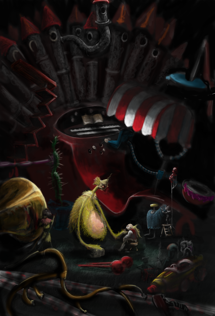
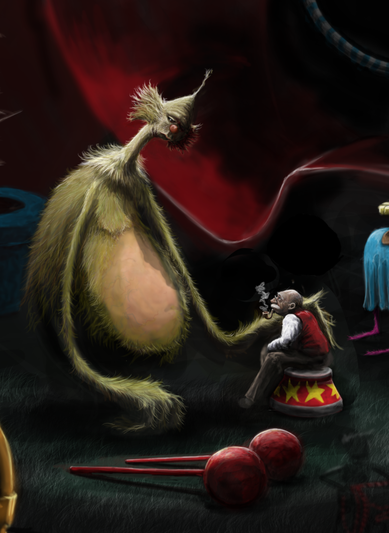
“Sneelock’s Lament” is based around the book “If I Ran The Circus” – one of my favourites – a book about a small boy who imagines putting on a circus of fantastical creatures and dazzling danger in the empty lot behind old man Sneelock’s shop.
Initially, in the boys imagination, Sneelock is happy to help out with small odds and ends, such as selling the lemonade. As his imagination goes wild, and things get bigger and bigger, Sneelock ends up performing all manner of death defying feats. The boy is convinced the whole time that Sneelock wouldn’t mind. I have often wondered if Sneelock ever got tired of what he was being asked to do….
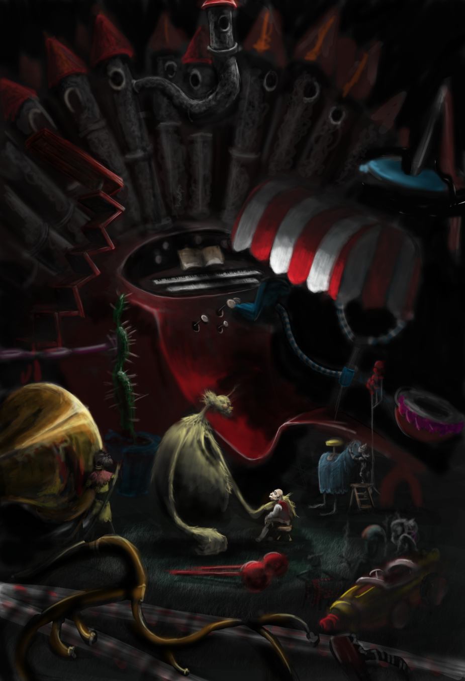
I started doodling while flicking through the book started working an image of the head of the Drum Tummied Snum, a massive creature, with a beaming smile who can drum any tune on his drum tummy.

I decided that he would feature in the image somehow, but that the mood would be far removed from the manic nature of the book, and in another sort of departure for me, set out to capture a feeling of melancholy – a kind of “after the show” feeling, when the audience has gone, the lights are down and the performers are done for the night.
I wanted to also push my self in terms of composition, so i knew that I’d need to take it much further than just the Snum, and needed to think about getting Sneelock in there.
One rare sunny afternoon, i sat with a friend in a beer garden, and we talked through ideas and ways to get the vibe across. It was suggested that I light it in a style similar to Caravaggio, and a thumbnail sketch was drawn.

In the story there are many different creatures performing all manner of acts, and there are also many different fantastic apparatus used in these acts. At one point the kid is in the opening parade and is sitting at a massive pipe organ being carried along enthusiastically belching out tunes. The organ looked bright, colourful and full of life being played, but i considered this instrument as a background to the scene, looming above them, unused and quiet now, a dull and lifeless behemoth.
I realised the characters that i’d chosen to depict, namely Sneelock and the Snumm, we’re very different in size. I felt it was important to show this aspect of their relationship, but then taking it all one step further and having the organ behind them as well meant i would need to make the finished image pretty big in order for Sneelock, the smallest but one of the most important elements, to be seen properly.
Other support charters i wanted to incorporate were the Tournament Knights with their Boxing Glove Spears, the Abrasion-Contusions, The Blindfolded Bowman, The Hoodwink, and The Remarkable Foon. There were others too, so many to choose from, but these are what i ended up with. To create the behind the scenes look i was going for, I also needed to incorporate other bits of equipment used in the show, and added the Welcoming Horn to the first digital sketch.

It was important that the support characters were kept subdued and as far removed form the typical Suess circus mania, so the Tournament Knight is gently talking with his mount as he grooms it, the Blindfolded Bowman checks the string of the bow, and others sit quietly smoking.
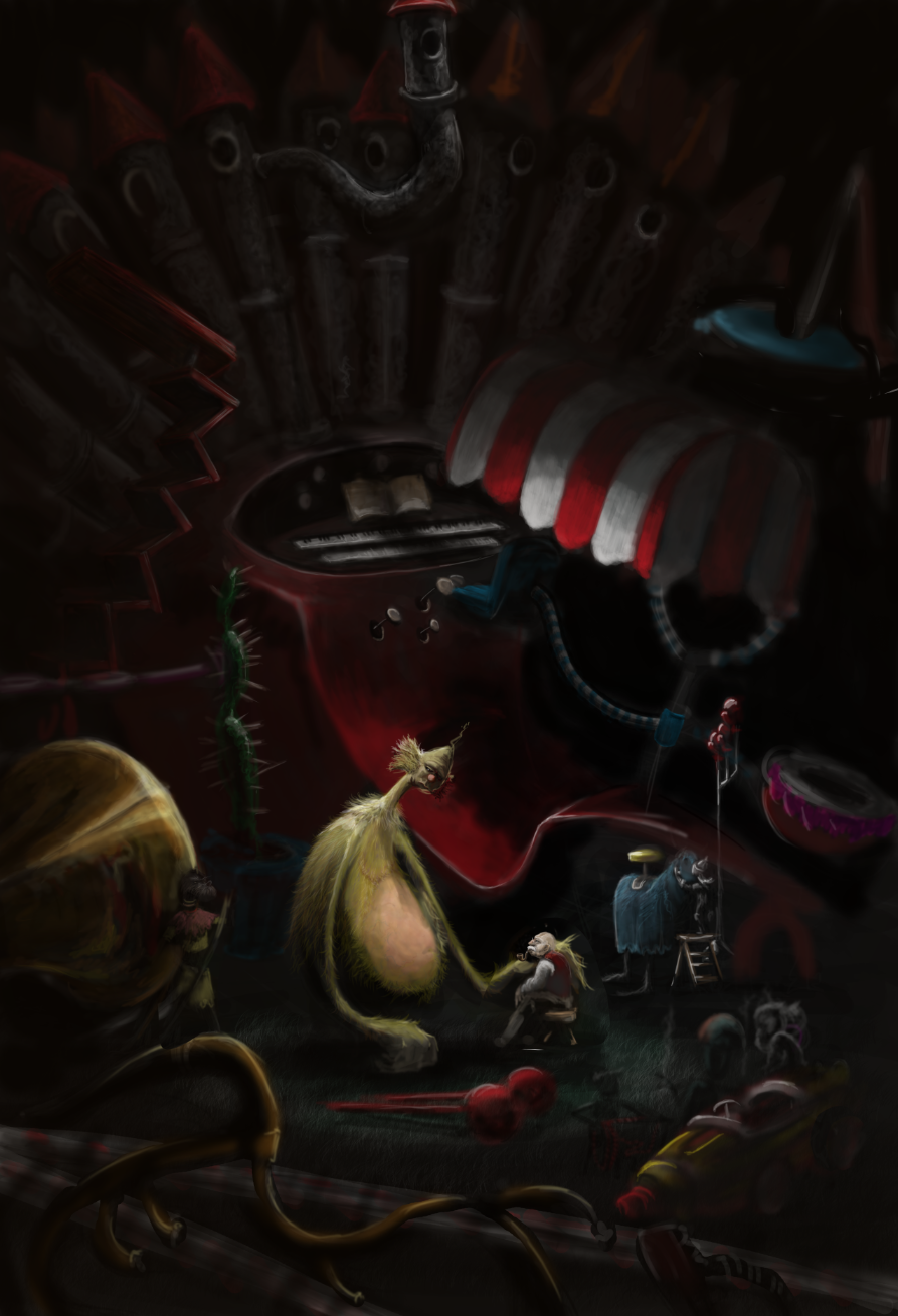
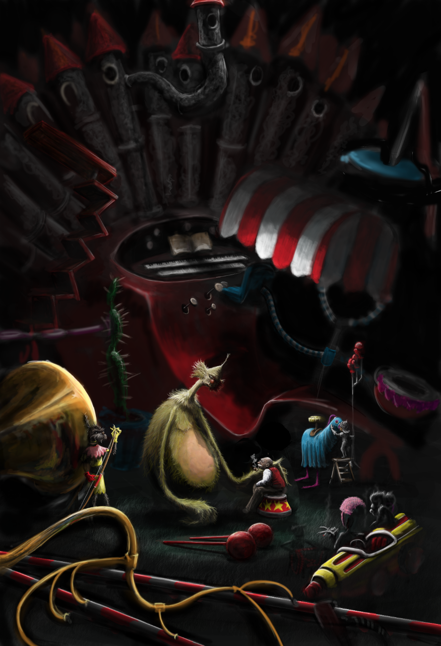
Having blocked out the positions and some of the values, i moving into blocking in some more colour, as well as adding some more equipment, to better balance the scene, and make it look more like back stage at the circus.

Next was to fine tune the texture of the pipes, get some reflection on the horn, and start working in some detail and depth into the objects. I also decided that Sneelock and the Snum needed to be making eye contact, so began working on Sneelock looking up into his eyes.
I wasn’t really happy with the roughly sketched head of the Snum, as it wasn’t close enough to the original look, so worked on it a little more to get a truer representation. Sneelock also needed more realism, so i also had a go a bringing that on. As i tend toward caricature normally, i found this a bit of a challenge…
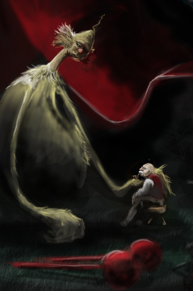
Working on the tummy was important – as it is worn by repeated drumming, it needed to look as though the hair that might have grown there once had been beaten away exposing the hard and leathery skin beneath.
The details continue to get filled in, and i quietly began to panic that it was actually far to much work for me to complete, in time, but more importantly, to my own satisfaction…. wasn’t sure that it wouldn’t just look completely awful.
But as the lighting, of the Snum particularly, began to work itself out, i was filled with a new round of enthusiasm.
So i knuckled down to sort out Sneelock a little better too.
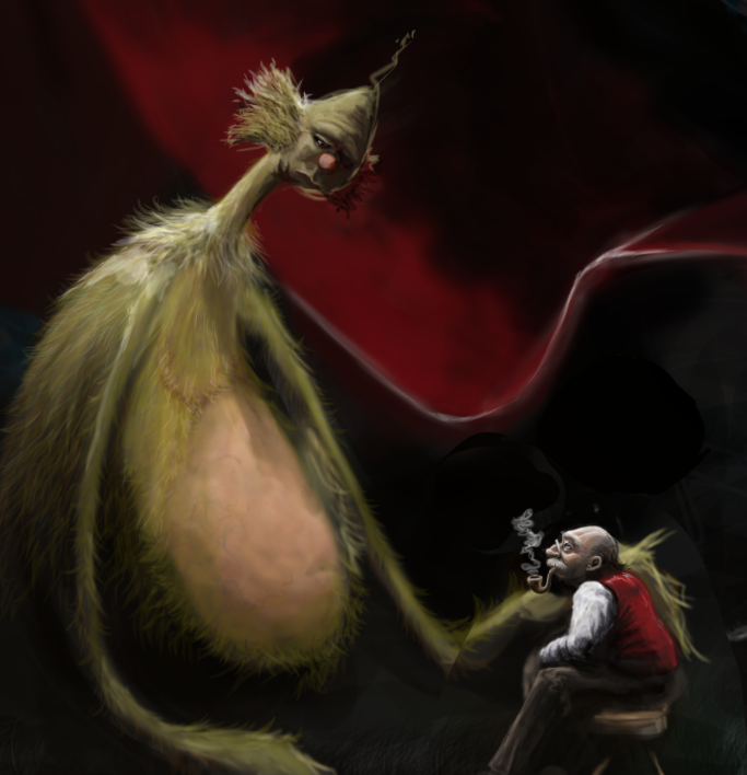
And began really pushing the highlights to bring out the form of the objects, and let them claim their own space in the image, knowing full well i’d be knocking them back down again later on…
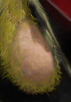
The hair on the Snum was took a long time, but became a meditation in lighting.
Right. I’m getting a cuppa.
(to be continued…)