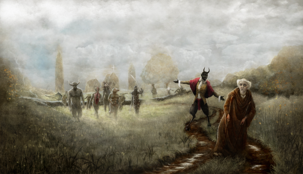
Illustrators Ireland’s upcoming exhibition is the Illustrated Beatles. 40 of the illustrators were give a random song title from the Beatles catalog. The song i was asked to illustrate was “Paperback Writer”. I need to admit to not being the biggest Beatles nerd in the world, though i was familiar with the tune from a slightly different arrangement, so needed to go and listen to the original, and track down a copy of the lyrics. I decided that rather than focus on the story of the narrator in the song, that of a wanna be writer almost begging a publishing house to publish his novel, i would focus on the story he had written, as he gave a vague and intriguing outline of the plot: “It’s a dirty story about a dirty man, and his clinging wife doesn’t understand“. Being a little perverse naturally , this instantly appealed and got me thinking. The narrator also goes onto say that it was “based on a book by Lear“, who was Edward Lear, who in 1846 had “A Book Of Nonsense” published, a volume of limericks he wrote and illustrated. I browsed these images and rhymes, looking for something that might tie in, until I found the wonderful image below…
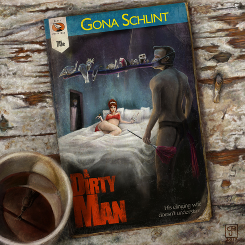
Well, when i saw this and knew that i need to do an image about dirty man, i recalled an odd “marital aid” i had seen on some *cough* …somewhere *cough*… can’t really remember, that was essentially a dildo that was strapped to ones face, though i cant imagine why. The similarities gave me a giggle. I did a quick sketch (below) to nut out the idea and see how it might work… I decided the mask alone wasn’t really dirty enough, so threw in the woman on the bed.

Still not dirty enough… “how about a gerbil in her hand?”, i wondered, thinking back to the old Richard Gere legend, but realised the connotations of such an act were biologically tricky. I imagine the average value of the circumference of any given anus, and the resulting writhing rodent bulk to said value’s ratio would require assistance. Enter the vaginal specula.
At this point i reckoned i was about as dirty is i needed to get to really get the point across subtly… The next bit was to try and capture something of the classic pulp fiction book covers of the 1960’s. I focused on some of the colour, detail, and importantly the parts where there was no detail, just splashes of colour suggesting the room and environments, and on the typography and layouts of these books. I quickly blocked it all in.

Made a couple of adjustments to the layout of the weird little elements these books have – tag lines and prices etc, and fiddled with what it might take to make the book look old and ratty looking, while still trying to work out the layout of the whole piece. After all, this was the cover of the book – a standard small paperback size – the end image in the show was to be a 45cm square. There was more thought needed…

Taking a bit of time to correct the posture of the man to better support the weight of the mask and birds in a realistic fashion, the birds themselves and work up the wife in the back ground a little more, i also decided to set it shot from above on a table top of some sort – still wasn’t sure what, but I chucked in a couple of props to set another scene.

I decided that the table should me a moldy nasty thing, so went looking online for such an item and found this:

The colours were a perfect reference for the kind of disgusting grime i wanted, and so i began working up a similar surface behind the book cup and cigarette butt, which honestly, took quite a bit of time…
I also began to wonder about the person who lived in this room, and had been sitting at this moldy desk reading this book, drinking a coffee and smoking a cigarette and began playing with other details that might explain the nature of the environment, and possibly the eventual frame of mind of the person who wrote the book. Was this the same person?

Then it was onto fixing up the women, and working out what was really happening there. Once done, i still wasn’t completely happy with the woman on the bed, but decided she could wait a little longer.

I started experimenting again layering textures some more to really give the book cover a worn down book, like it had been bought and sold several times over the years, and treated poorly the whole time. I also began to place some shadows in the room to support the lighting seen in the coffee cup.

Happy enough for now with the texture layers, i returned focus to the typography and the layout of the book cover. The throw away tagline “thirteen birds, two women and a gerbil” originally used needed to go, and it was replaced with another line form the song, and i finally got around to finishing the birds. Having just returned form a trip to Australia, I’d decided to throw in a few Australian natives, for a bit of colour and interest.
Not happy with the woman’s face, and the angle of the head, i decided to work her over a bit too. The coffee cup also got a bit a reworking to deepen the shadow in the room, and create a slightly more sinister tone in there. I had been thinking the book cover seemed a little off balance, to in the darker shadows behind the man, painted the tassels of another marital aid that might also take his debauchery to a slightly higher level. In needing to finish his hand, i realised the tumbler of whiskey he’d been holding – a prop common in images form this era – was completely redundant given his complete inability to drink while wearing the mask, so i painted the hand with out the glass, and considered my options…

I had fun creating the publisher label, Nasty Partridge, and decided on a couple more layout changes to fit it in properly. Building on the previous texture layers, combines with a couple of gradient fills began to create more depth in the room, to help gel all the objects in the environment. The addition of the feather duster balanced the colours on the cover a little more, and well as helping direct the eye around the scene.

Making the bra and knickers slightly more transparent heightened the seduction, and final part was just adding some colour to the reclining woman’s hair, and also some cascading curls to help the seductive look.

And a few people have been looking for a clever explanation behind the authors name, Gona Schlint. With a bit of backwards engineering, I’ll say it’s an anagram of “glint on cash”.
So all in all, there was a fair amount of work in evolved, and if i add up the sporadic hours i was working , there was probably about a week in it, but I am pretty happy with the results, even if it does contribute to the solidification of my reputation as a bit of a dirty man….
Can’t wait for the exhibition.